


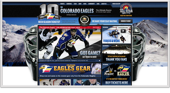
work performed under the employment of Madwire Media
Colorado Eagles:
date: June 2012
Hands down the most exciting project I have ever worked on is the Colorado Eagles Official Website. (Demo Concept 1 shown here) A huge thanks to Madwire Media for making something like this possible. I'm honored to be a part of a project like this. Stay tuned for the new updated design and more from this site.
![]()
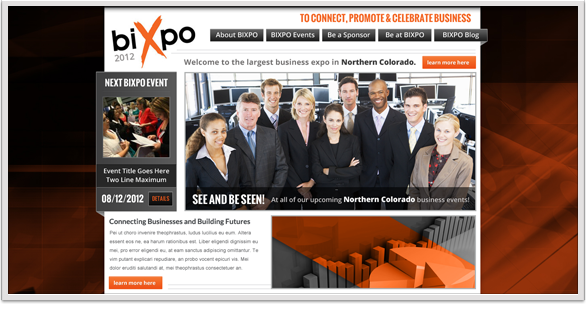
work performed under the employment of Madwire Media
BIXPO 2012:
date: July 2012
The BIXPO 2012 design was another exciting project to work on... this was the initial concept and there's no way to tell where the design will go from here, but I like this look for the impact of the colors and the brand.
![]()
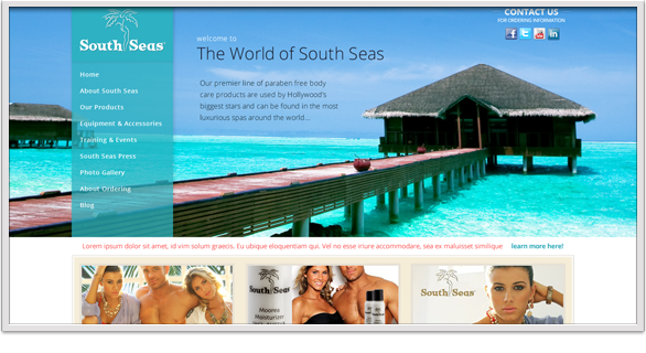
work performed under the employment of Madwire Media
South Seas:
date: July 2012
The South Seas site design was exciting but so difficult. With an odd palette and strange requests to implement it was more challenging than necessary for a good brand.
![]()
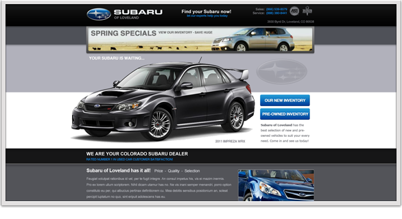
work performed under the employment of Madwire Media
Subaru Loveland:
date: July 2012
I always enjoy automotive sites, and Subaru Loveland was no exception. I love the images and colors on this layout. It has a unique feel with an easily recognized brand and serves as a great landing page.
![]()
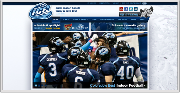
work performed under the employment of Madwire Media
Colorado Ice Football:
date: September 2011
This was one of my most exciting projects. With the rising popularity of indoor football and the sport oriented nature of Colorado in general, I am quite proud of designing and working on this site.
![]()
other designs for this project:
![]()
![]()
![]()
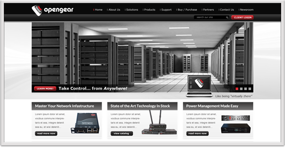
work performed under the employment of Madwire Media
Open Gear:
date: April 2012
A wider and more horizontal layout was used for the Open Gear home page. Integrating their colors and logo into a stark and simple design made the information and product both stand out easily. This specific design was not used, but is a great example regardless.
![]()
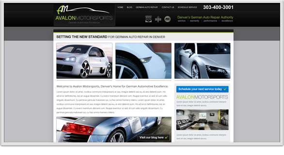
work performed under the employment of Madwire Media
Avalon Motorsports:
date: April 2012
The Avalon Motorsports projects are my very favorite to work on. There are numerous examples of their sites here and will probably be more. I feel they typically speak for themselves.
![]()
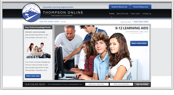
work performed under the employment of Madwire Media
Thompson Online:
date: May 2012
Thompson Schools Online was a great project for many reasons. From a design standpoint the logo and bold color choices made the site come together. From a more personal perspective, It is always nice to work on important projects that can help an overall community.
![]()

work performed under the employment of Madwire Media
PayLeap P4:
date: April 2012
Another PayLeap design that came together well in a short timeframe. This P4 landing page is another example of brand recognition combined with a basic mix of imagery, where colors and icons stich together a finished design.
![]()
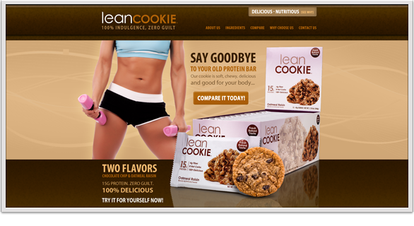
work performed under the employment of Madwire Media
Lean Cookie:
date: January 2012
Though not a fan of cookies or healthy food, I would probably still try this item based on their website. A powerful yet clean layout with subtle strengths and a very professional feel. This was a challenging but fun design project for a great product.
![]()
live - breathe - dream - art