


work performed under the employment of Madwire Media
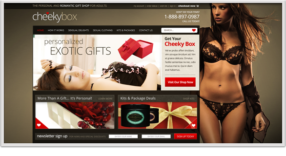
Cheeky Box:
date: July 2012
Cheeky Box had a great idea, but nothing at all to work with content wise unfortunately. It is difficult when trying to bring someone's niche vision to life with absolutely nothing. The site came out beautiful, with a great mix of color, imagery, and contrast.
![]()

work performed under the employment of Madwire Media
Syndicated Solar:
date: July 2012
This site has a different color palette and layout than I would typically use. Admittedly it isn't really a favorite project, just a current one. They had some good ideas, and it's an intersting design that's still solid.
![]()
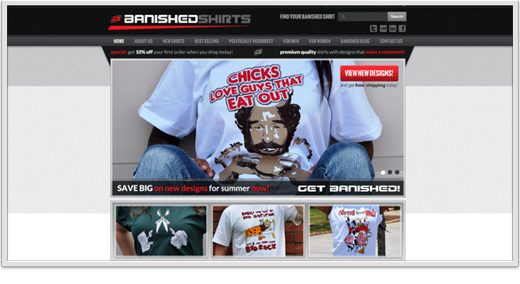
work performed under the employment of Madwire Media
Banished Shirts:
date: June 2012
The Banished shirts site has some very different design features, and again a red color range, (which I don't always enjoy) but admittedly I do like the site itself. I would never purchase these juvenile shirts personally, but I'd check out the site for some time either way.
![]()

work performed under the employment of Madwire Media
PayLeap Home:
date: May 2012
Following my earlier development portal design, PayLeap has continued to work with us for many other projects. The redesign of their corporate home page was huge and exciting for me. This project held tight to their existing branding and colors with a fresh new layout.
![]()
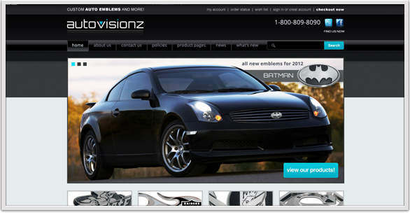
work performed under the employment of Madwire Media
Autovisionz:
date: May 2012
Another design that was both fun and frustrating for the same reasons was the Autovisionz site. With no existing website or content, I designed a logo on the fly and chose everything else from layout to colors on my own. This can be much easier but is not always successful. In this case, the client agreed and bought a logo as well.
![]()
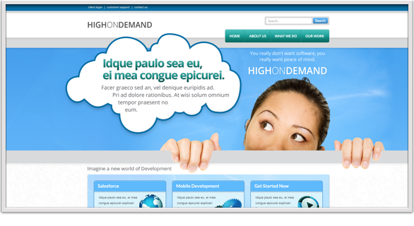
work performed under the employment of Madwire Media
High on Demand:
date: April 2012
A simple and open layout that is still slightly abstract, and was fairly fun to do. Though the client specifically requested "filler text" in areas I would normally fill, it still is an interesting design.
![]()
work performed under the employment of Madwire Media
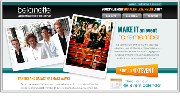
Bella Notte:
date: May 2012
Even though this client didn't work out, the actual design work done for them is still noteworthy. This was an uncontained layout using requested imagery and colors. Another logo I designed while building the site and a different feel are the things I like here.
![]()
work performed under the employment of Madwire Media
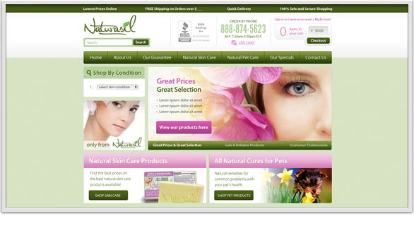
Naturasil Rebuild:
date: April 2012
After months of work and many hours of design, we scrapped our original plan for Naturasil and redesigned the home page for another round. This design, version 6, finally stuck and has moved forward thus far. I personally like the earlier version, shown in my favorites, but this is still a good design.
![]()
work performed under the employment of Madwire Media
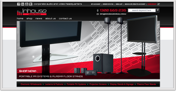
In House Audio:
date: March 2012
Though not my usual color spectrum, the In House Audio Visual site turned out to be a great mix with high contrast and eye-catching reds. I typically favor cooler color ranges but I feel this worked out well using very little imagery and solid content areas.
![]()

work performed under the employment of Madwire Media
My Weekend:
date: March 2012
The My Weekend site started out easy enough. They preferred no scrolling and very few images. It grew quickly into a rather large home page filled with a vast array of calls to action, numerous sections, products and a large footer area. Still, the site has come together well.
![]()
live - breathe - dream - art